Essential Tips To Design A Call-To-Action Button For Your Website
- By Michael Samson
- •
- 30 Apr, 2019
- •
As the world has become more digital the importance of a website has increased. A well-designed website will result in more sales and retention of the customers. There are several elements to the design which make it more effective, but call to action button holds the most significance. This one button will make the passive users of the website more engaged and active participants.
The design of the CTA button also becomes a determinant on whether the products will end up in the cart for check out or in the wish list. When you own a business, then the CTA button is the goal where customers should click, and the design of the button should be the catalyst.
If you are not sure on the designing process of the button, then you need to take the help of the professional. When in UAE then you can always look for the best website design company in Dubai to come up with the great call to action button for your site. While you are doing that read on this article to know some handy tips for designing the CTA element for your web page.
Designing a useful CTA button for website:
Your online presence means that you want to reach out to the customers in a trendy way so that they will purchase the products and service you offer. CTA button is one way to do that, but what if your button is nowhere to be found or it is not that attractive then you are less likely to have sales.
There is nothing hard in designing a CTA button, but just small improvements can make it more engaging. Following are essential elements which make call to action irresistible and engagement more users:
Size of the CTA button:
When you are designing a website, then the component of visual hierarchy comes into play. According to this the larger the object is the more significance it has. When you are designing the CTA button, then you need to keep in mind that it has the visual weight to grab the attention of the customers.
When designing the button for the site also consider the varying size of devices like a button might be more prominent on a cell phone but smaller on a laptop or tablet.
Color and contrast:
You want people to see it right away so it should not be of the same color as background because it will be hard to locate in that case. You need to see if the button stands out on the site without any color distraction.
The size of the button will not make any sense if the colors make it hard to find on the page. The selection of the color should complement the overall design and not something like pick the odd one out.
Look of the button:
When time and again you are referring an element of your site as a button, then it should look like one. Anything which is clickable does not mean it is a button because there is some physical appearance which makes people relate to it.
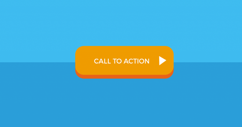
Use borders, a button like a shape (mostly rectangular) and even try to create a 3D effect giving it an edgy look. Also, there should be color gradient enhancing the visual appeal of the button.
Take away!
CTA button is not just like any button but is a gateway to the customers and more sales. If the users have to play a guessing game for finding the button, then they might end up closing the site. Obviously, you do not want that so why not design an effective button.
When you are not sure how to do that at that moment, you can take the help from web design professionals so that you have nothing to worry about the call to action button.
Happy Designing!


